St Kilda Legal Service
A website that does justice to the organisation it represents
The LGBTIQ Legal Service asked Paper Giant to help them create a website that would demonstrate their credibility, showcase their work, and provide a safe and accessible portal for potential clients.
Outcomes
-
We successfully designed and launched the new LGBTIQ Legal Service website
-
A flexible, modular design system and set of content recommendations to ensure the website continues to serve the LGBTIQ community well into the future
Services
- Service Design
- Co-design
Sectors
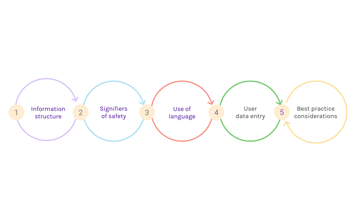
Understanding content needs
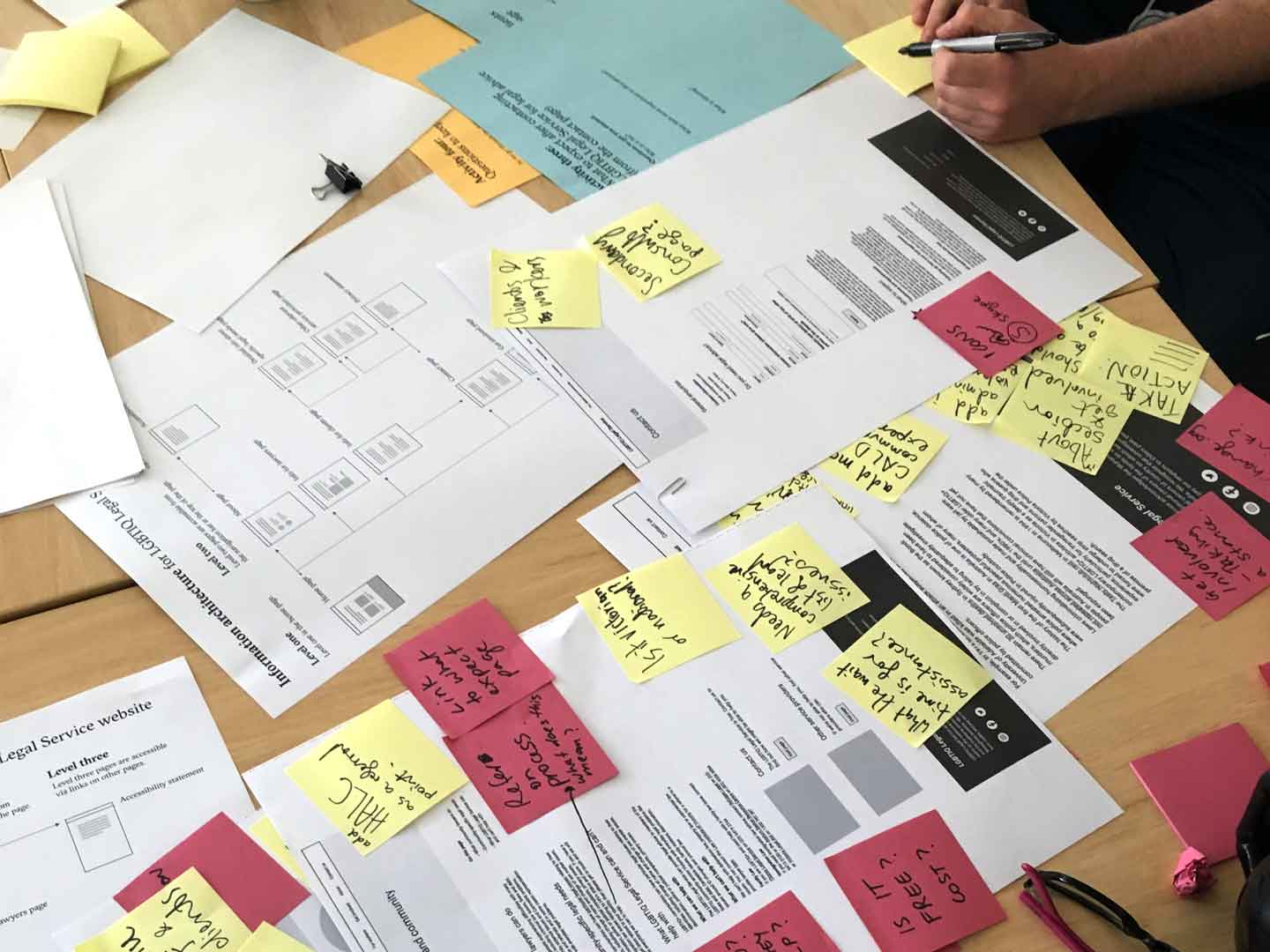
After working with the LGTBIQ Legal Coordinator to outline the content needed and build a preliminary information architecture, we held a content review workshop with LGBTIQ Legal Service and their partner, Thorne Harbour Health.
This crucial workshop set the direction for the content going forward and determined what the website was to become. LGBTIQ Legal Service said they found it valuable to be in the room and see what people’s immediate reactions to their ideas were.
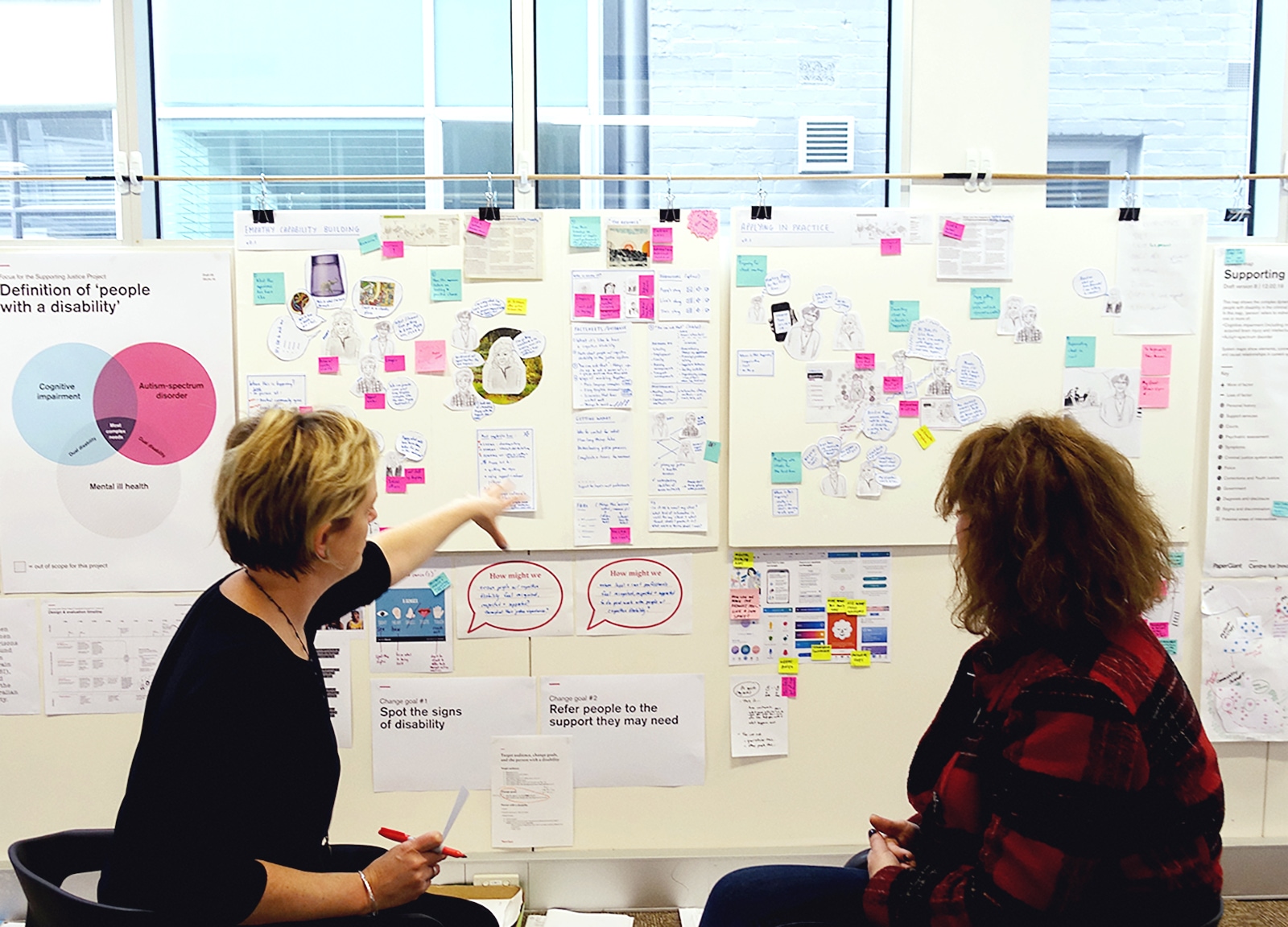
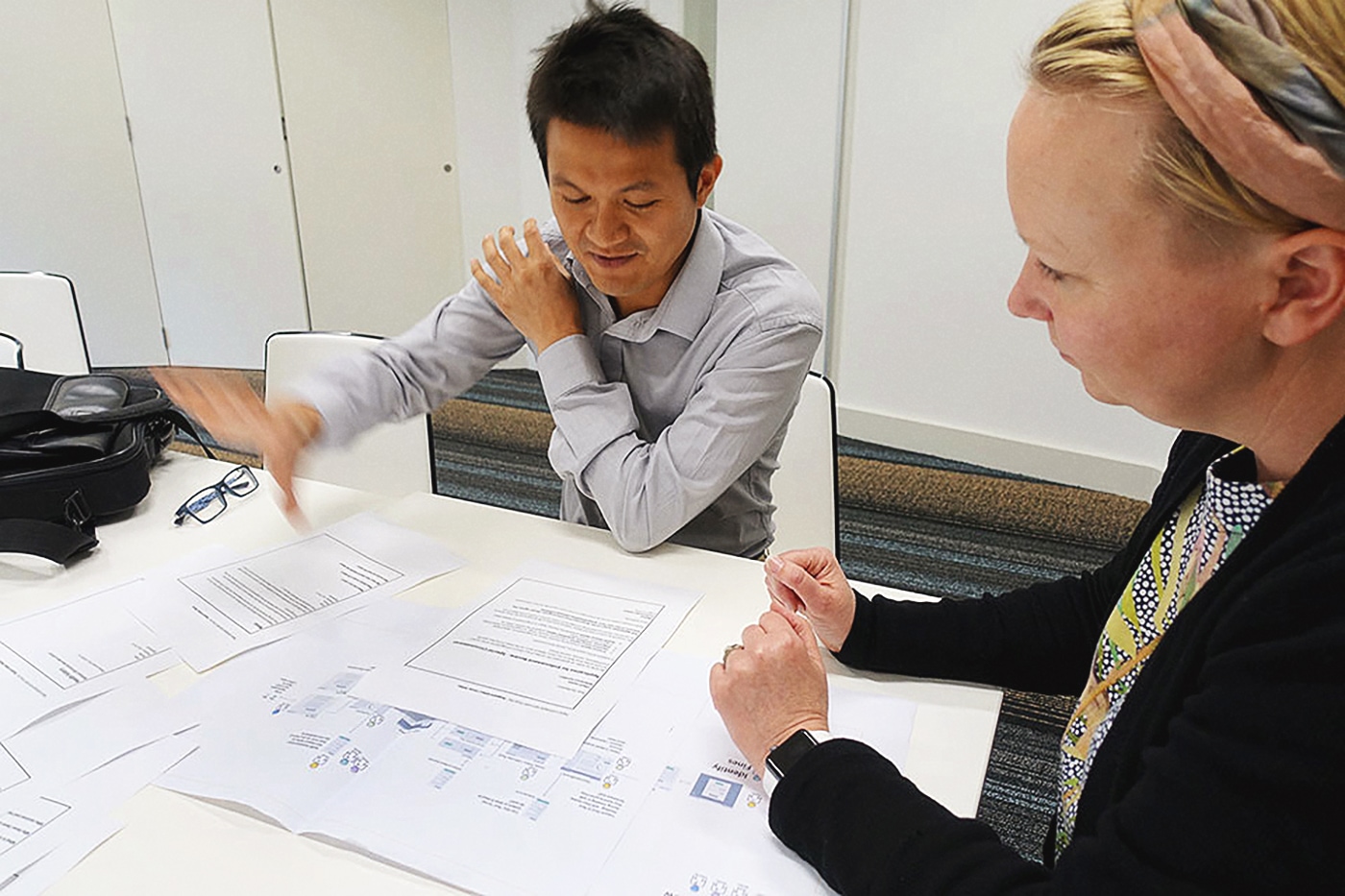
Getting stakeholder buy-in
The second workshop covered branding and design and included people from a whole range of different organisations, such as advocacy groups for people with disability, community health caseworkers, and so on.
Most stakeholder concerns at this workshop were in fact about the content, given its weight and sensitivity. Because we had already held the content review workshop, we were able to demonstrate that we were already thinking deeply about people’s areas of concern. This put stakeholders at ease and gave them confidence in the project, making them much more willing to participate enthusiastically in the branding workshop.
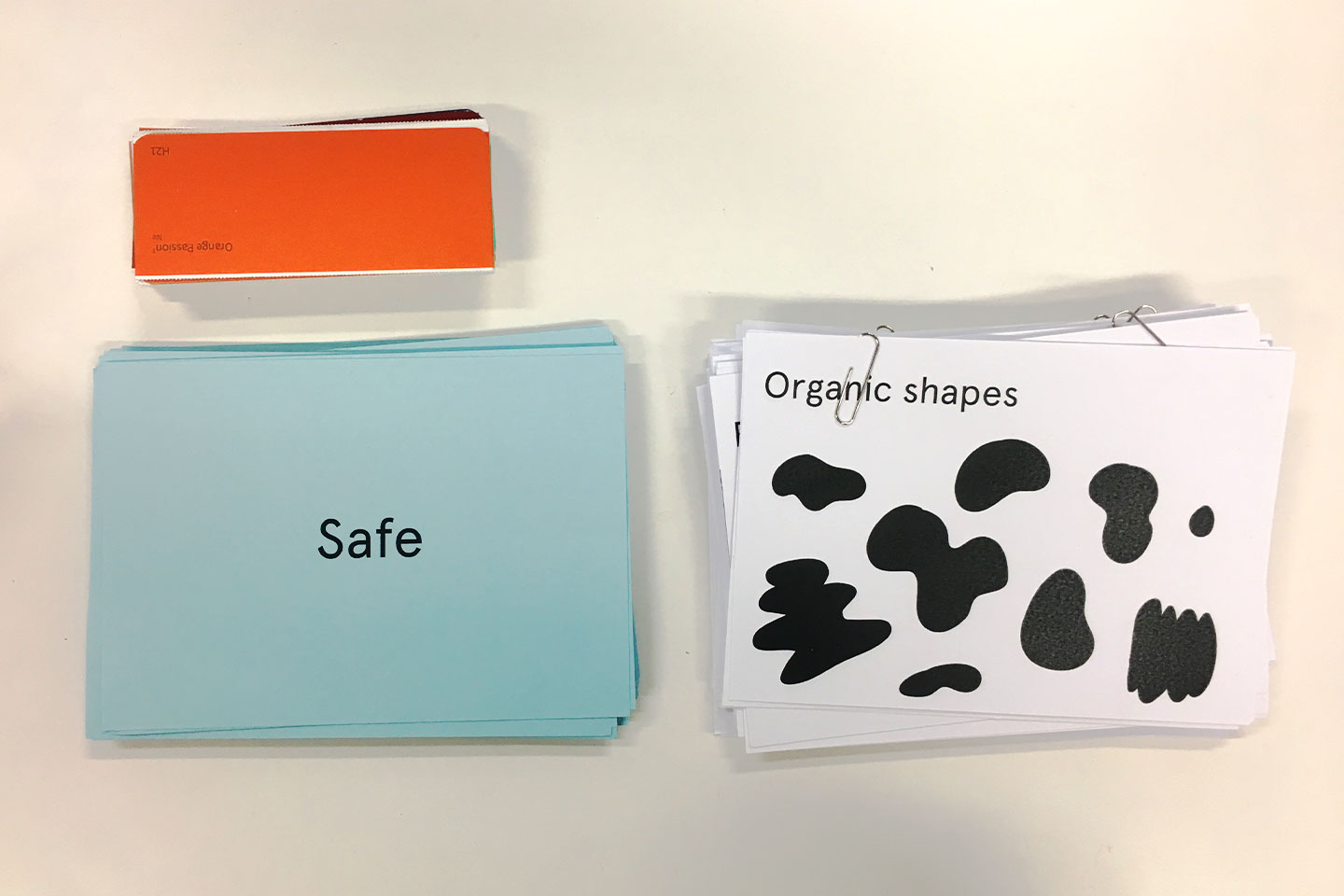
LGBTIQ branding without the clichés
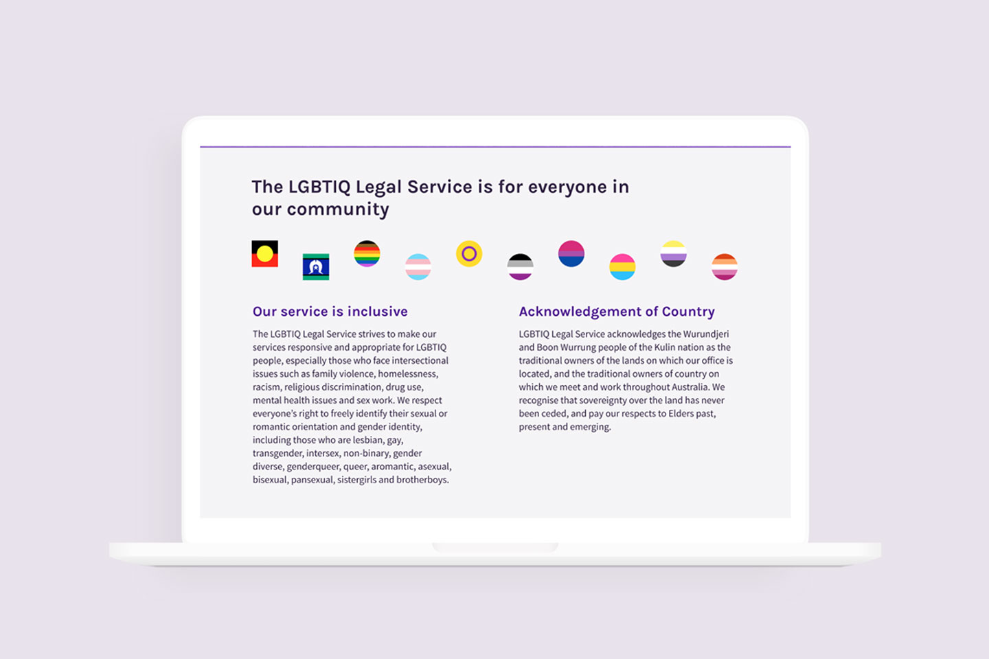
Branding for LGBTIQ community organisations tends to rely heavily on rainbow flags and other stock imagery (handprints are common). There’s nothing inherently wrong with this, but LGBTIQ Legal Service wanted branding that was specific and appropriate to the services they offer, rather than just signifying the community they serve.
This was validated at the branding workshop, where people from a huge variety of advocacy organisations, as well as people with lived experience, gave their input on the designs. People felt the more low-key branding would be welcoming to people who may not feel comfortable with others knowing they access the service – for example if someone were to walk past and see the website open.
Stakeholders also felt that the non-stereotypical branding respected the fact that their lives and identities are multi-dimensional, beyond just their gender and sexuality.
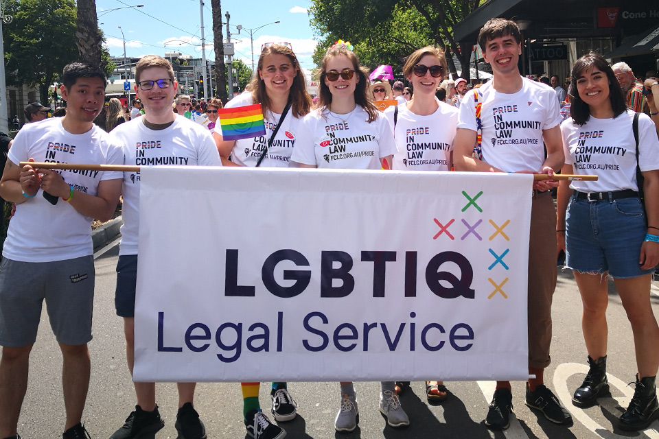
We were delighted to hear that LGBTIQ Legal Service had the new logo printed on a full-sized banner to carry at Midsumma Pride March.
Communicating safety
Although we wanted to think beyond rainbow flags, we also wanted to ensure that the website felt safe and inclusive to people from a wide variety of communities. LGBITQ people, Aboriginal people, and other groups often have a history of being dismissed, insulted or victim-blaming when they reach out for legal support.
People who are typically excluded are likely to assume they are excluded unless services actively and explicitly welcome them.
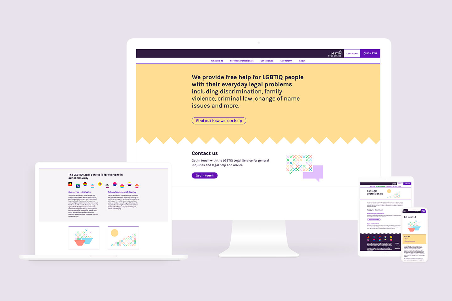
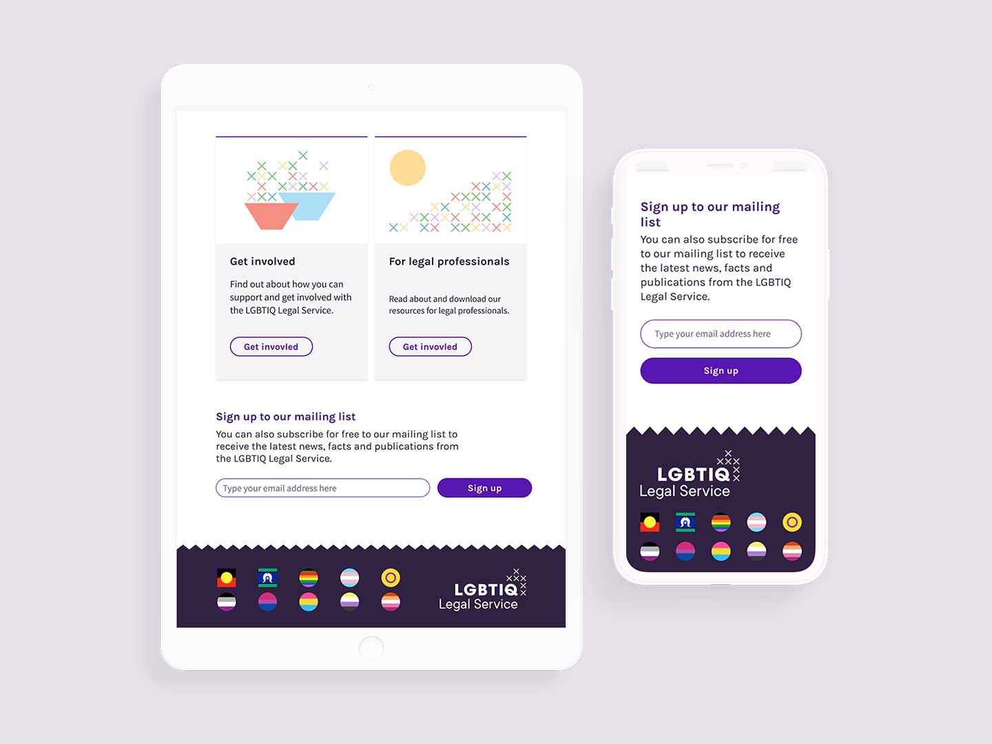
The solution we found was to add a module to the homepage that houses 10 different pride flags (such as asexual, nonbinary and intersex), as well as the Aboriginal and Torres Strait Islander flags. These sit alongside a statement of inclusivity and Acknowledgement of Country.
From a traditional UI perspective, this module is counterintuitive: it takes up a lot of real estate on the home page and doesn’t ‘do’ anything. But in fact it does a lot of heavy lifting in terms of signaling what kind of organisation this is and who it's for.
This module was one of the most important to stakeholders at the workshop, and users have responded very positively in testing.
Front-loading our web design efforts to avoid launch delays
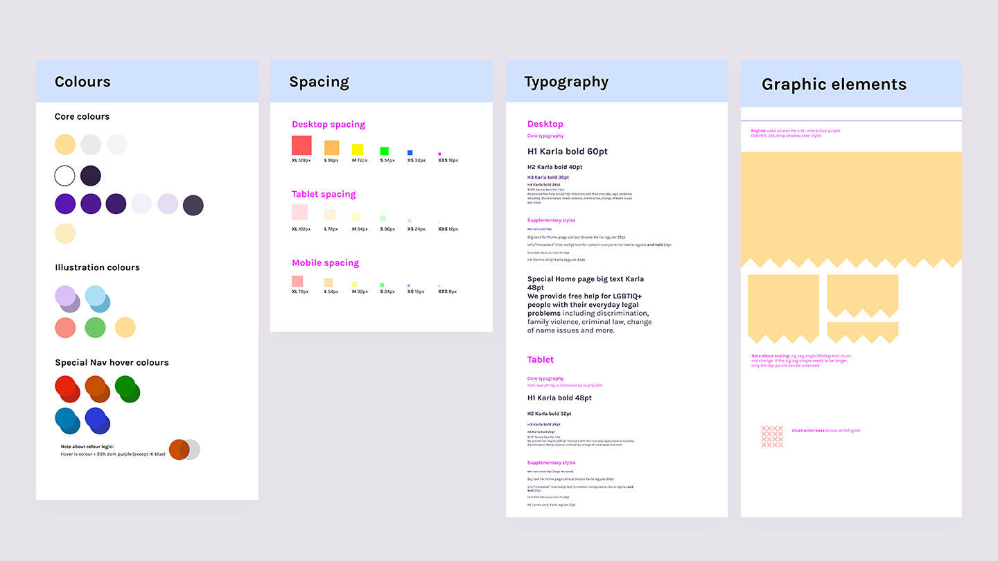
To ensure the website met stakeholders’ expectations and to ensure we met a tight launch deadline, Paper Giant put together a thorough design underpinned by an adapted atomic design system methodology. All components were modularly constructed and we provided all the design details for phone, tablet and desktop versions, going above and beyond with accompanying documentation.
Because the programmer had everything they needed from the moment of handover, there was very little tweaking needed and we avoided any complications or need to re-work.
Although the website is currently small scale, the system we built for it is flexible and the site can grow in size and complexity as LGBTIQ Legal Service does, without needing a re-design.
Amplifying networks
The highly polished and useable site, alongside the non-stereotypical branding, has increased LGBTIQ Legal Service’s legitimacy and credibility within their ecosystem. It gives them a platform from which to build connections within not only the justice, not-for-profit, and community legal sectors, but also reaching out to government and other grants and funding bodies.
The LGBTIQ Legal Service has done a significant amount of law reform work, but this work has not been visible. Now it is all showcased on the site, easily findable and easily searchable. Already the LGBTIQ Legal Service has reported positive responses from their networks as organisations become more aware of the great work they have been doing.
Building communications capacity
Throughout the content development and review process, LGBTIQ Legal Service staff learned a lot about writing for web, writing for non-legal experts, and writing in a way that connects with their community.
The client stated that writing about the service enabled them to externalize a lot of things that hadn't been formally documented. It has allowed them to see a clear form and structure to the work they do, and to communicate that. The client plans to write this newly externalised knowledge into an internal handbook.
After the website was launched, we did further user-testing on the content, identifying things of value that could be added in the future. We packaged these recommendations up into a guide to how they might like to think about developing additional content going forward.
The LGBTIQ Legal Service is an outreach program of St Kilda Legal Service.